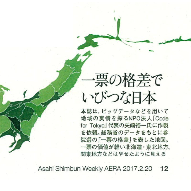
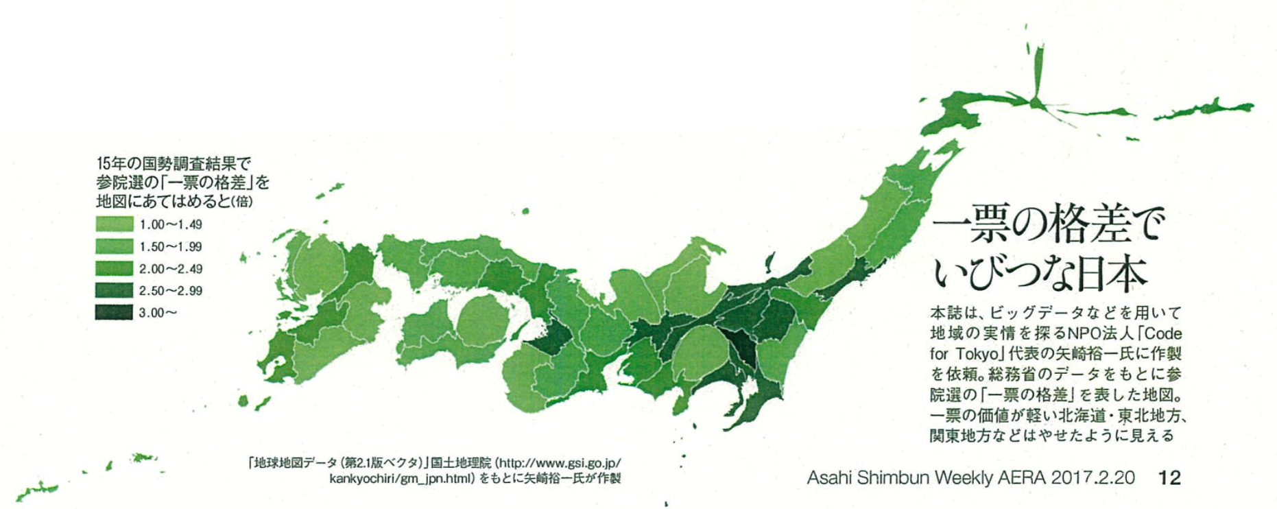
A cartogram visualization of “vote-value disparity” data, created for the magazine AERA.
Publication Date
February 20, 2017
Project Client
AERA
Project Description
Visualized “vote-value disparity” (ippyō no kakusa) data as a cartogram. Multiple algorithms were evaluated; data was processed in QGIS, rendered in D3.js, and finalized in Adobe Illustrator as print-ready artwork.

Project Role
Data processing, figure production, preparation of print-ready artwork.