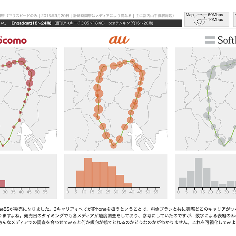
When all three Japanese carriers started offering the iPhone for the first time in 2013, I visualized and compared the actual connection quality of each carrier on a map.

Publication Date
September 20, 2013
Project Client
Personal project
Project Description
The iPhone 5S launched on September 20. With all three carriers carrying the iPhone for the first time, which carrier would actually connect best — alongside the pricing plans — became a widely shared concern. Media outlets ran speed tests on launch day and I referred to them, but the results were published only as tables of numbers, which are neither intuitive nor easy to combine across sources to see any pattern. That was the motivation to try visualizing them.