
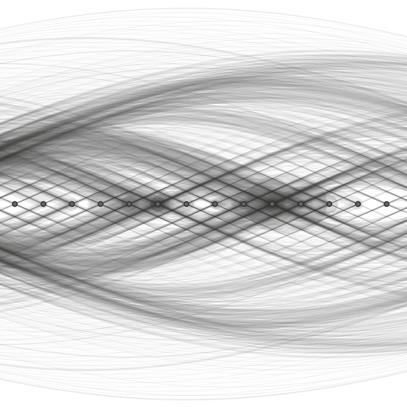
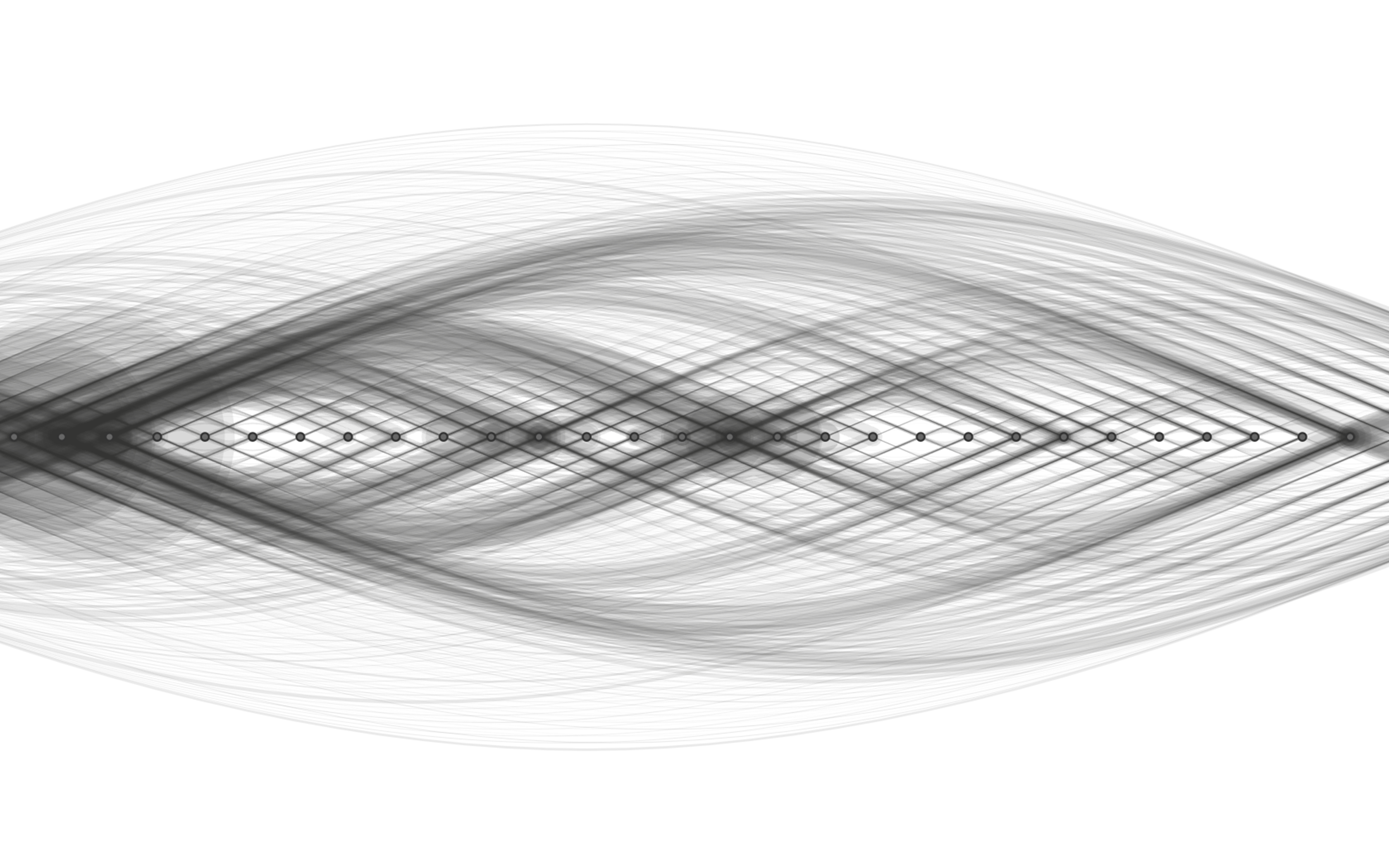
Visualization of migration flows between Japan’s three major metropolitan areas as a network diagram.
Publication Date
August 22, 2015
Project Client
Personal project
Project Description
To intuitively grasp population movement within Japan — which is usually visualized as a map or a table — I adopted an arc diagram to represent the data as a network. For each of the three major metropolitan areas, selecting a from/to origin filters the data on the fly.
Project Role
Art direction, design, front-end coding, and data processing — all handled personally.